A ROOM WITH A HUE
Making Color Work In Your Home
The psychology of color has long fascinated interior designers and homeowners alike. The hues we choose for our living spaces don’t just reflect our personal taste, they actively shape our moods, influence our behavior, and transform the perceived dimensions of our rooms. In this guide, we’ll explore how to harness the power of four fundamental colors to create spaces that both look and feel exactly right
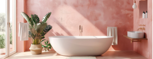
THE PINK RENAISSANCE
Once relegated to nurseries and teenage bedrooms, pink has undergone a sophisticated revival in modern interior design. Today’s pinks are nuanced and mature, ranging from subtle blush tones to deep coral hues. The key to working with pink lies in understanding its undertones and choosing the right companions.
For a contemporary look, pair dusty rose with charcoal gray or deep navy blue. These combinations create a balanced atmosphere that feels both fresh and grounded. In living spaces, pink can create a warm, welcoming environment that flatters skin tones and promotes conversation. The secret is moderation, consider using pink as an accent wall or through textiles rather than painting an entire room.
Design Tip: To prevent pink from feeling too sweet, incorporate natural materials like wood and stone. Their organic textures help anchor the color and add depth to the space.
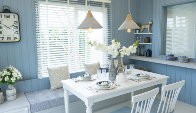
BLUE: THE VERSATILE CLASSIC
Blue remains the world’s favorite color, and for good reason. From ethereal sky blue to dramatic navy, this versatile hue can create any atmosphere. In bedrooms, lighter blues promote tranquility and better sleep, while deeper blues in home offices can enhance focus and productivity.
The magic of blue lies in its ability to expand space visually. Light blues can make small rooms feel larger and airier, especially when used on ceilings. Darker blues, conversely, can add intimacy to oversized rooms or create a cozy reading nook.
Design Tip: When working with blue, pay attention to natural light. North-facing rooms benefit from warmer blues with yellow undertones, while south-facing spaces can manage cooler, more dramatic blue hues.
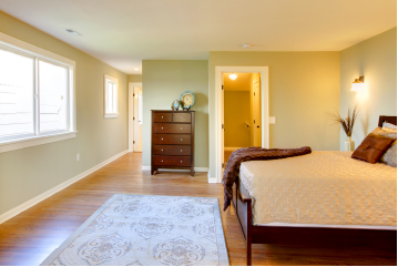
GREEN: A NATURAL TOUCH
As our lives become increasingly digital, the desire to connect with nature has made green an essential color in contemporary interiors. From sage to emerald, green brings vitality and balance to any space. It’s particularly effective in rooms where you want to promote relaxation and restoration.
Kitchen designs are embracing green through cabinetry and backsplashes, creating spaces that feel fresh and invigorating. In living rooms greens can create a sophisticated backdrop for artwork and furnishings, while softer sage tones work beautifully in bedrooms and bathrooms.
Design Tip: Combine different shades of green in the same space for a layered, botanical feel. Use darker greens for larger pieces like sofas or cabinets, and lighter tones for accessories and accent pieces.
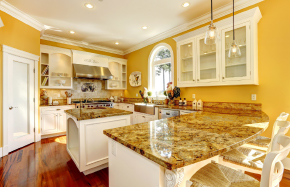
YELLOW: THE SUNSHINE SOLUTION
Yellow, the color of sunshine and optimism, brings an immediate burst of energy and warmth to any space. This powerful hue has the unique ability to transform even the darkest corners into vibrant, welcoming areas that radiate their own light. From buttery pastels to rich golden tones, yellow’s range offers solutions for various design challenges.
Research indicates that yellow stimulates mental activity and generates muscle energy, making it particularly effective in breakfast nooks, kitchens, and home offices where alertness and productivity are desired. However, designers caution that moderation is key—too much yellow can be overwhelming. The solution often lies in strategic deployment: a yellow accent wall in a gray room, sunny curtains in a neutral space, or golden accessories that catch and reflect light.
Design Tip: For rooms with northern exposure, choose yellows with a hint of red undertone (like butter yellow or warm honey) rather than green-based yellows.
GRAY: THE NEW NEUTRAL
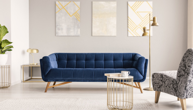
Gray has revolutionized the concept of neutral colors in interior design. Unlike beige or white, gray provides depth and sophistication while maintaining versatility. The key to successful gray spaces lies in understanding undertones—some grays lean warm with brown or purple undertones, while others stay cool with blue or green bases.
In contemporary homes, gray serves as an excellent foundation for both bold and subtle color schemes. It can function as a sophisticated backdrop for vibrant art pieces or create a calming monochromatic scheme when used in varying shades.
Design Tip: Layer different textures in gray spaces to prevent them from feeling flat. Combine matte and glossy finishes, and incorporate materials like velvet, linen, and metallics.
MAKING IT ALL WORK
Remember that color is deeply personal, and while design rules provide useful guidelines, your home should reflect your taste and lifestyle. The most successful spaces are those where color enhances both the aesthetic appeal and functional aspects of your daily life.
Whether you’re drawn to the sophistication of gray, the tranquility of blue, the vitality of green, or the warmth of pink, there’s a perfect color palette waiting to transform your home


